Market Pulse
Scope
UX study · Product Design
Client
Concept
Year
[2025]
Industry
Trading Platform
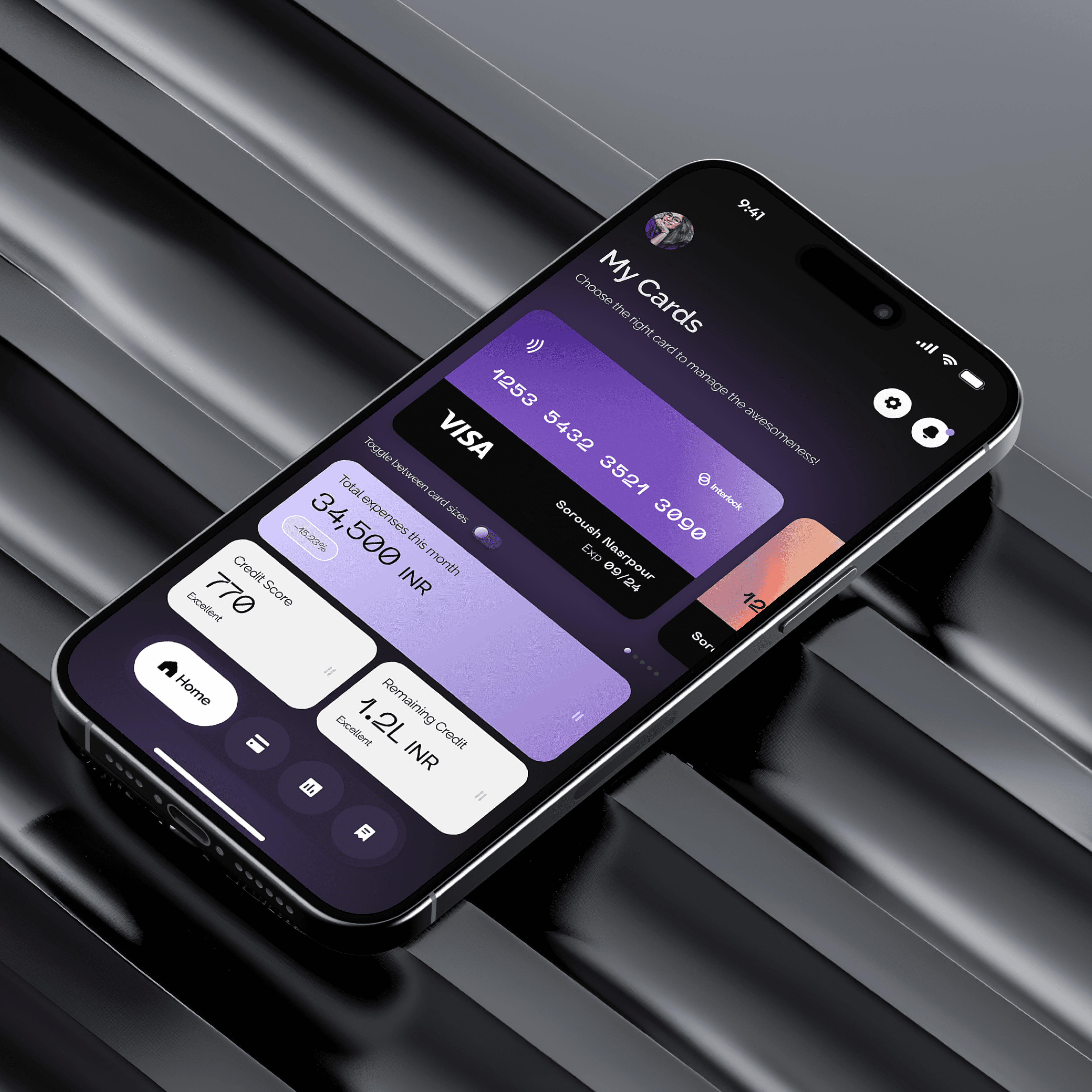
Market Pulse: Empowering the Modern Investor
The Context
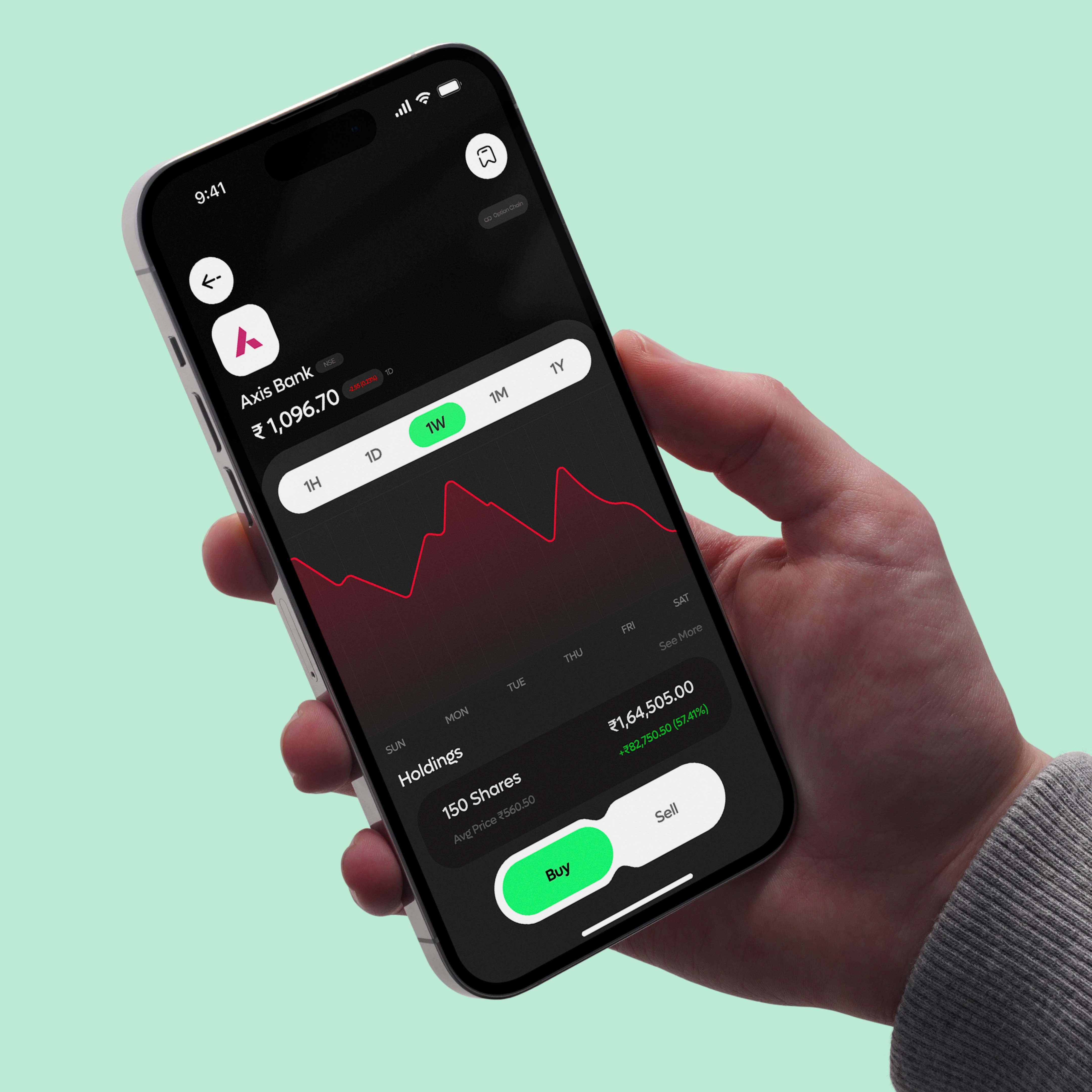
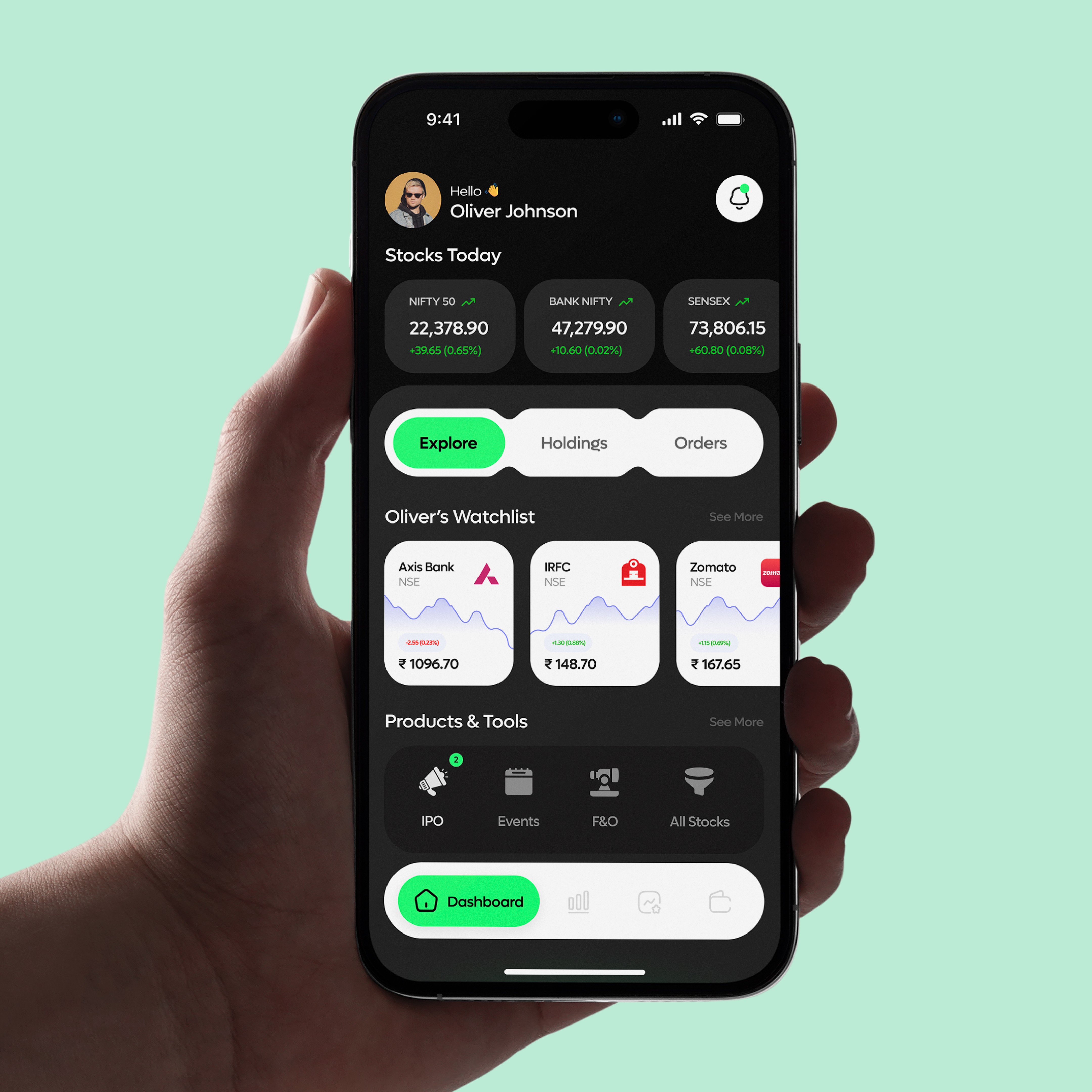
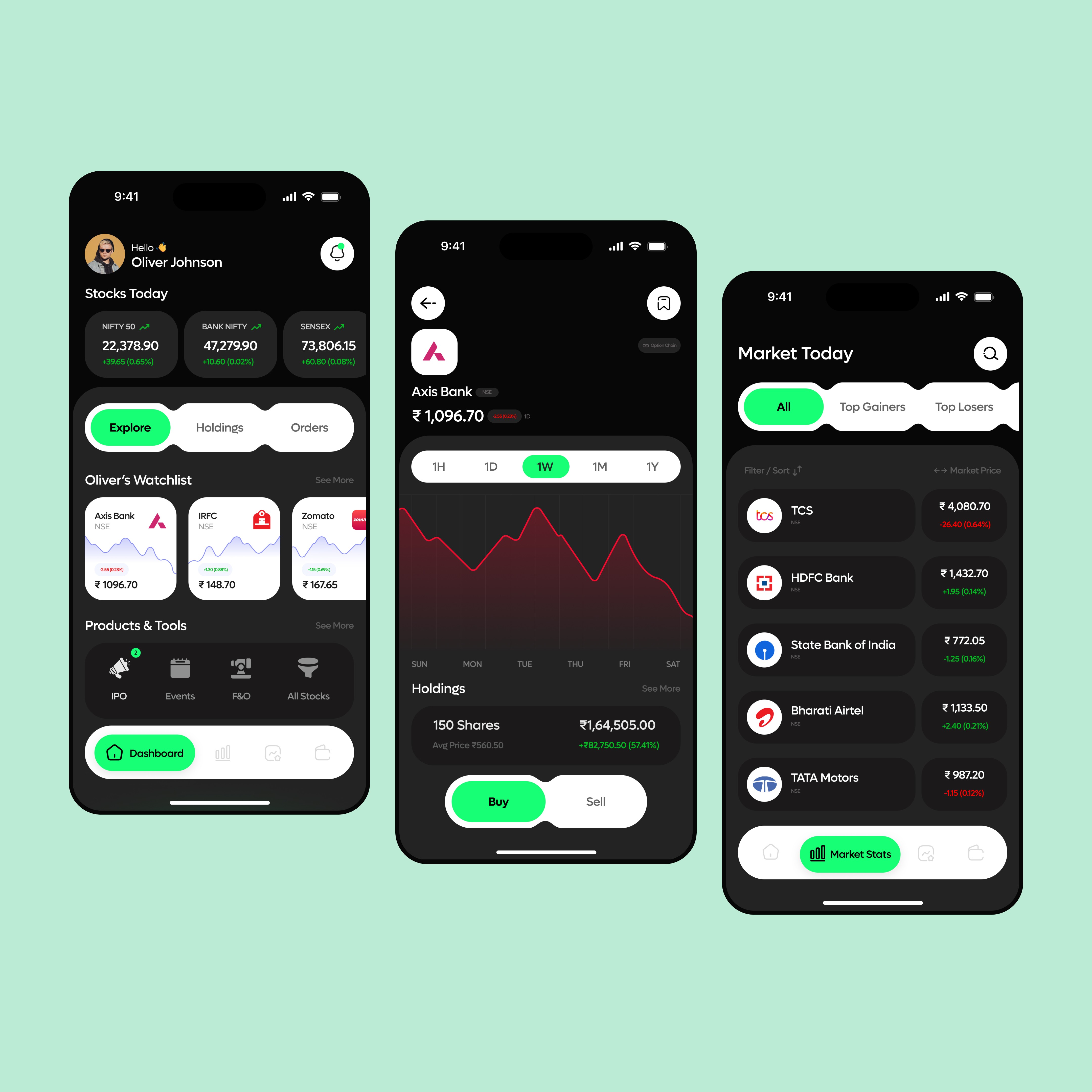
Market Pulse is a high-performance trading platform designed to bridge the gap between complex market data and actionable investment insights. The objective was to create a mobile-first dashboard where users can monitor live market indices, manage a personalized watchlist, and execute trades with zero friction. In a landscape often cluttered with intimidating charts and dense text, Market Pulse was designed to provide a professional-grade trading experience with the ease of a lifestyle application.
The Research and UX Understanding
My research centered on the psychological concept of loss aversion and the cognitive load required for rapid decision-making. Investors need to feel in control and informed without being overwhelmed by peripheral data. To address this, I implemented a progressive disclosure strategy: high-level market summaries are visible at a glance, while detailed technical charts and order books are only a tap away.
I focused on the ergonomics of one-handed trading. By placing critical navigation and action buttons—like the Buy and Sell toggles—within the natural reach of the thumb, I minimized the physical effort required to react to market volatility. This UX approach ensures that the user remains focused on the strategy rather than the interface.

The UI Execution
The visual language is rooted in Empathetic Clarity, utilizing a soft, trust-driven color palette and high-legibility typography to ensure accessibility across all age groups.
Aesthetic Identity: I utilized a card-based system with "Friendly Geometry"—rounded corners and organic shapes that feel approachable rather than institutional. The interface uses a clean, white-space-driven layout to ensure that high-density medical data remains readable and non-intimidating.
Typography and Iconography: I used a bold, accessible sans-serif for time-sensitive data (like dosage timings) to ensure zero ambiguity. The iconography is custom-designed for quick recognition, allowing users to differentiate between pill types and health categories at a glance.
The Vital Dashboard: I designed the health tracking module using simplified trend lines. By translating raw biometric data into visual "Healthy Zones," I allowed users to understand their progress without needing a medical background.
Business Logic and CX Execution
To ensure the product scales as a professional health tool, I focused on data portability and high-value integration.
Customer Experience (CX) Design: I introduced a "Report Onboarding" feature that allows users to instantly share verified data logs with their doctors. This shifts the app’s value from a passive logbook to an active diagnostic tool, significantly increasing its utility in a professional medical context.
Technical Alignment: I built the system with a modular component library that supports a wide range of vital inputs—from blood glucose to heart rate. The UI is architected to remain stable even when large PDF reports are uploaded, ensuring a seamless experience for developers managing heavy data transfers.
Product Positioning: The approach targets the "Sandwich Generation"—adults managing both their own health and the health of aging parents. By positioning Veda as a premium, all-in-one health concierge, the design justifies a higher tier of user trust and market authority.
The Outcome
The result is a highly functional, compassionate digital journey that bridges the gap between patient needs and professional medical requirements. By balancing rigorous technical logic with an empathetic visual identity, I created a product that makes the heavy task of health management feel light and manageable. Veda stands as a definitive example of my ability to design complex, multi-user platforms that solve real-world human challenges.
Market Pulse
Scope
UX study · Product Design
Client
Concept
Year
[2025]
Industry
Trading Platform
Market Pulse: Empowering the Modern Investor
The Context
Market Pulse is a high-performance trading platform designed to bridge the gap between complex market data and actionable investment insights. The objective was to create a mobile-first dashboard where users can monitor live market indices, manage a personalized watchlist, and execute trades with zero friction. In a landscape often cluttered with intimidating charts and dense text, Market Pulse was designed to provide a professional-grade trading experience with the ease of a lifestyle application.
The Research and UX Understanding
My research centered on the psychological concept of loss aversion and the cognitive load required for rapid decision-making. Investors need to feel in control and informed without being overwhelmed by peripheral data. To address this, I implemented a progressive disclosure strategy: high-level market summaries are visible at a glance, while detailed technical charts and order books are only a tap away.
I focused on the ergonomics of one-handed trading. By placing critical navigation and action buttons—like the Buy and Sell toggles—within the natural reach of the thumb, I minimized the physical effort required to react to market volatility. This UX approach ensures that the user remains focused on the strategy rather than the interface.
The UI Execution
The visual language is rooted in Empathetic Clarity, utilizing a soft, trust-driven color palette and high-legibility typography to ensure accessibility across all age groups.
Aesthetic Identity: I utilized a card-based system with "Friendly Geometry"—rounded corners and organic shapes that feel approachable rather than institutional. The interface uses a clean, white-space-driven layout to ensure that high-density medical data remains readable and non-intimidating.
Typography and Iconography: I used a bold, accessible sans-serif for time-sensitive data (like dosage timings) to ensure zero ambiguity. The iconography is custom-designed for quick recognition, allowing users to differentiate between pill types and health categories at a glance.
The Vital Dashboard: I designed the health tracking module using simplified trend lines. By translating raw biometric data into visual "Healthy Zones," I allowed users to understand their progress without needing a medical background.
Business Logic and CX Execution
To ensure the product scales as a professional health tool, I focused on data portability and high-value integration.
Customer Experience (CX) Design: I introduced a "Report Onboarding" feature that allows users to instantly share verified data logs with their doctors. This shifts the app’s value from a passive logbook to an active diagnostic tool, significantly increasing its utility in a professional medical context.
Technical Alignment: I built the system with a modular component library that supports a wide range of vital inputs—from blood glucose to heart rate. The UI is architected to remain stable even when large PDF reports are uploaded, ensuring a seamless experience for developers managing heavy data transfers.
Product Positioning: The approach targets the "Sandwich Generation"—adults managing both their own health and the health of aging parents. By positioning Veda as a premium, all-in-one health concierge, the design justifies a higher tier of user trust and market authority.
The Outcome
The result is a highly functional, compassionate digital journey that bridges the gap between patient needs and professional medical requirements. By balancing rigorous technical logic with an empathetic visual identity, I created a product that makes the heavy task of health management feel light and manageable. Veda stands as a definitive example of my ability to design complex, multi-user platforms that solve real-world human challenges.