Northline Collective
Scope
Brand Identity · Digital Experience
Client
Northline Collective
Year
[2026]
Industry
Architecture & Spatial Design
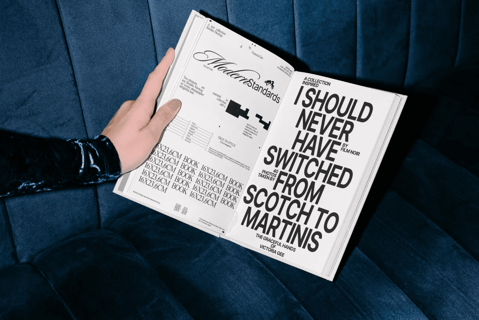
Northline Collective is a multidisciplinary creative group working across culture, design, and strategy. The objective was to create a digital identity that felt cohesive, expressive, and structured — without feeling rigid.
Context
The collective’s work spanned multiple disciplines, but their online presence lacked a unified system. The challenge was to design a platform that could hold diversity while maintaining a clear visual language.
Approach
A flexible grid system was developed to support varied content while preserving structure. Typography was expressive but controlled, creating a balance between character and clarity.
The interface was kept minimal, allowing projects and narratives to lead, while the system worked quietly in the background.
Outcome
Northline Collective now operates within a clear digital framework that supports growth and evolution. The platform feels open, adaptive, and considered — reflecting the collective’s creative philosophy.
Credits
Creative Direction & Design
Adrian Bennett


The UI Execution
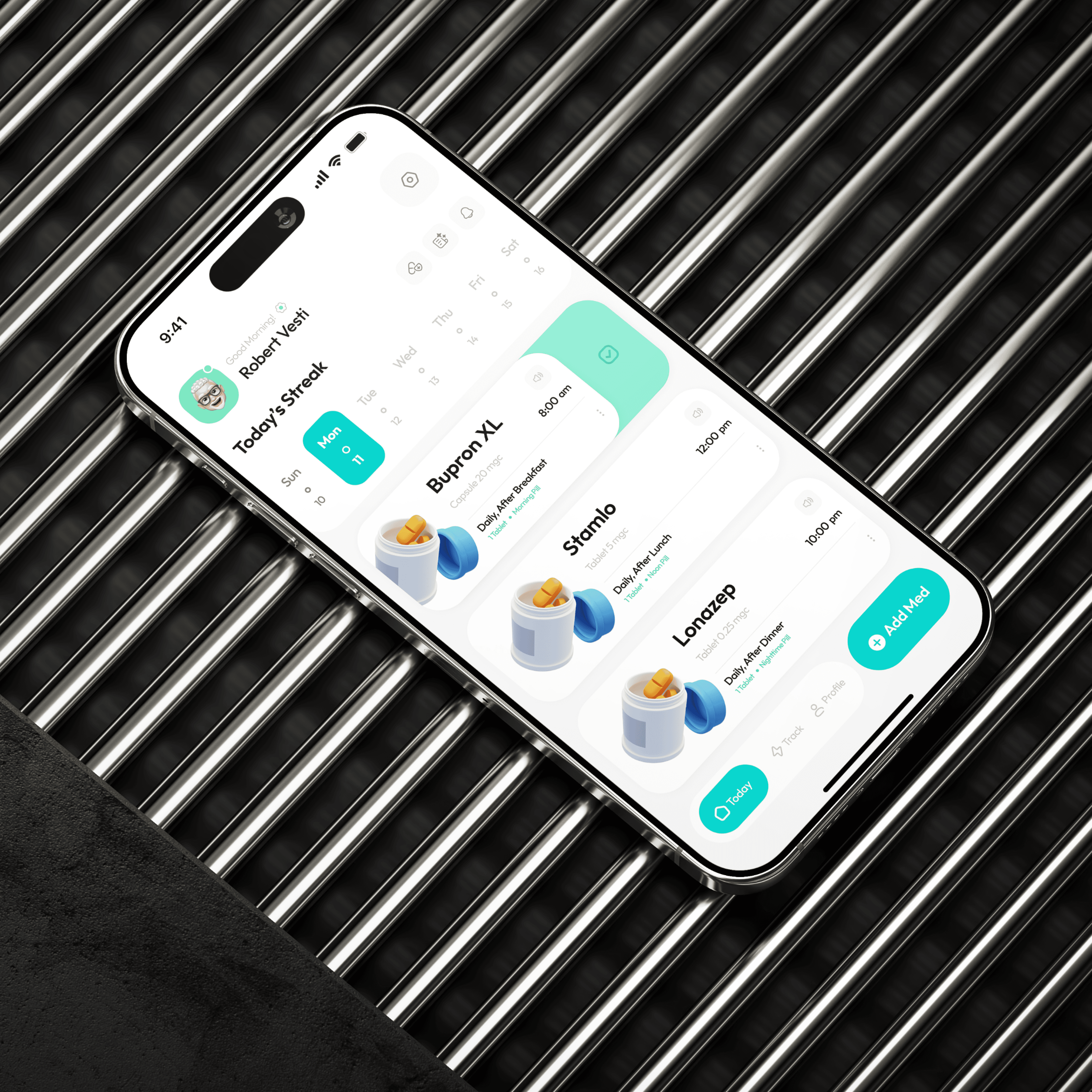
The visual language is rooted in Empathetic Clarity, utilizing a soft, trust-driven color palette and high-legibility typography to ensure accessibility across all age groups.
Aesthetic Identity: I utilized a card-based system with "Friendly Geometry"—rounded corners and organic shapes that feel approachable rather than institutional. The interface uses a clean, white-space-driven layout to ensure that high-density medical data remains readable and non-intimidating.
Typography and Iconography: I used a bold, accessible sans-serif for time-sensitive data (like dosage timings) to ensure zero ambiguity. The iconography is custom-designed for quick recognition, allowing users to differentiate between pill types and health categories at a glance.
The Vital Dashboard: I designed the health tracking module using simplified trend lines. By translating raw biometric data into visual "Healthy Zones," I allowed users to understand their progress without needing a medical background.
Business Logic and CX Execution
To ensure the product scales as a professional health tool, I focused on data portability and high-value integration.
Customer Experience (CX) Design: I introduced a "Report Onboarding" feature that allows users to instantly share verified data logs with their doctors. This shifts the app’s value from a passive logbook to an active diagnostic tool, significantly increasing its utility in a professional medical context.
Technical Alignment: I built the system with a modular component library that supports a wide range of vital inputs—from blood glucose to heart rate. The UI is architected to remain stable even when large PDF reports are uploaded, ensuring a seamless experience for developers managing heavy data transfers.
Product Positioning: The approach targets the "Sandwich Generation"—adults managing both their own health and the health of aging parents. By positioning Veda as a premium, all-in-one health concierge, the design justifies a higher tier of user trust and market authority.
The Outcome
The result is a highly functional, compassionate digital journey that bridges the gap between patient needs and professional medical requirements. By balancing rigorous technical logic with an empathetic visual identity, I created a product that makes the heavy task of health management feel light and manageable. Veda stands as a definitive example of my ability to design complex, multi-user platforms that solve real-world human challenges.
Northline Collective
Scope
Brand Identity · Digital Experience
Client
Northline Collective
Year
[2026]
Industry
Architecture & Spatial Design
Northline Collective is a multidisciplinary creative group working across culture, design, and strategy. The objective was to create a digital identity that felt cohesive, expressive, and structured — without feeling rigid.
Context
The collective’s work spanned multiple disciplines, but their online presence lacked a unified system. The challenge was to design a platform that could hold diversity while maintaining a clear visual language.
Approach
A flexible grid system was developed to support varied content while preserving structure. Typography was expressive but controlled, creating a balance between character and clarity.
The interface was kept minimal, allowing projects and narratives to lead, while the system worked quietly in the background.
Outcome
Northline Collective now operates within a clear digital framework that supports growth and evolution. The platform feels open, adaptive, and considered — reflecting the collective’s creative philosophy.
Credits
Creative Direction & Design
Adrian Bennett
The UI Execution
The visual language is rooted in Empathetic Clarity, utilizing a soft, trust-driven color palette and high-legibility typography to ensure accessibility across all age groups.
Aesthetic Identity: I utilized a card-based system with "Friendly Geometry"—rounded corners and organic shapes that feel approachable rather than institutional. The interface uses a clean, white-space-driven layout to ensure that high-density medical data remains readable and non-intimidating.
Typography and Iconography: I used a bold, accessible sans-serif for time-sensitive data (like dosage timings) to ensure zero ambiguity. The iconography is custom-designed for quick recognition, allowing users to differentiate between pill types and health categories at a glance.
The Vital Dashboard: I designed the health tracking module using simplified trend lines. By translating raw biometric data into visual "Healthy Zones," I allowed users to understand their progress without needing a medical background.
Business Logic and CX Execution
To ensure the product scales as a professional health tool, I focused on data portability and high-value integration.
Customer Experience (CX) Design: I introduced a "Report Onboarding" feature that allows users to instantly share verified data logs with their doctors. This shifts the app’s value from a passive logbook to an active diagnostic tool, significantly increasing its utility in a professional medical context.
Technical Alignment: I built the system with a modular component library that supports a wide range of vital inputs—from blood glucose to heart rate. The UI is architected to remain stable even when large PDF reports are uploaded, ensuring a seamless experience for developers managing heavy data transfers.
Product Positioning: The approach targets the "Sandwich Generation"—adults managing both their own health and the health of aging parents. By positioning Veda as a premium, all-in-one health concierge, the design justifies a higher tier of user trust and market authority.
The Outcome
The result is a highly functional, compassionate digital journey that bridges the gap between patient needs and professional medical requirements. By balancing rigorous technical logic with an empathetic visual identity, I created a product that makes the heavy task of health management feel light and manageable. Veda stands as a definitive example of my ability to design complex, multi-user platforms that solve real-world human challenges.