Mood Palette
Scope
UX study · Product Design
Client
Concept
Year
[2025]
Industry
Mental Health
Mood Palette: Translating Emotional Nuance into Digital Clarity
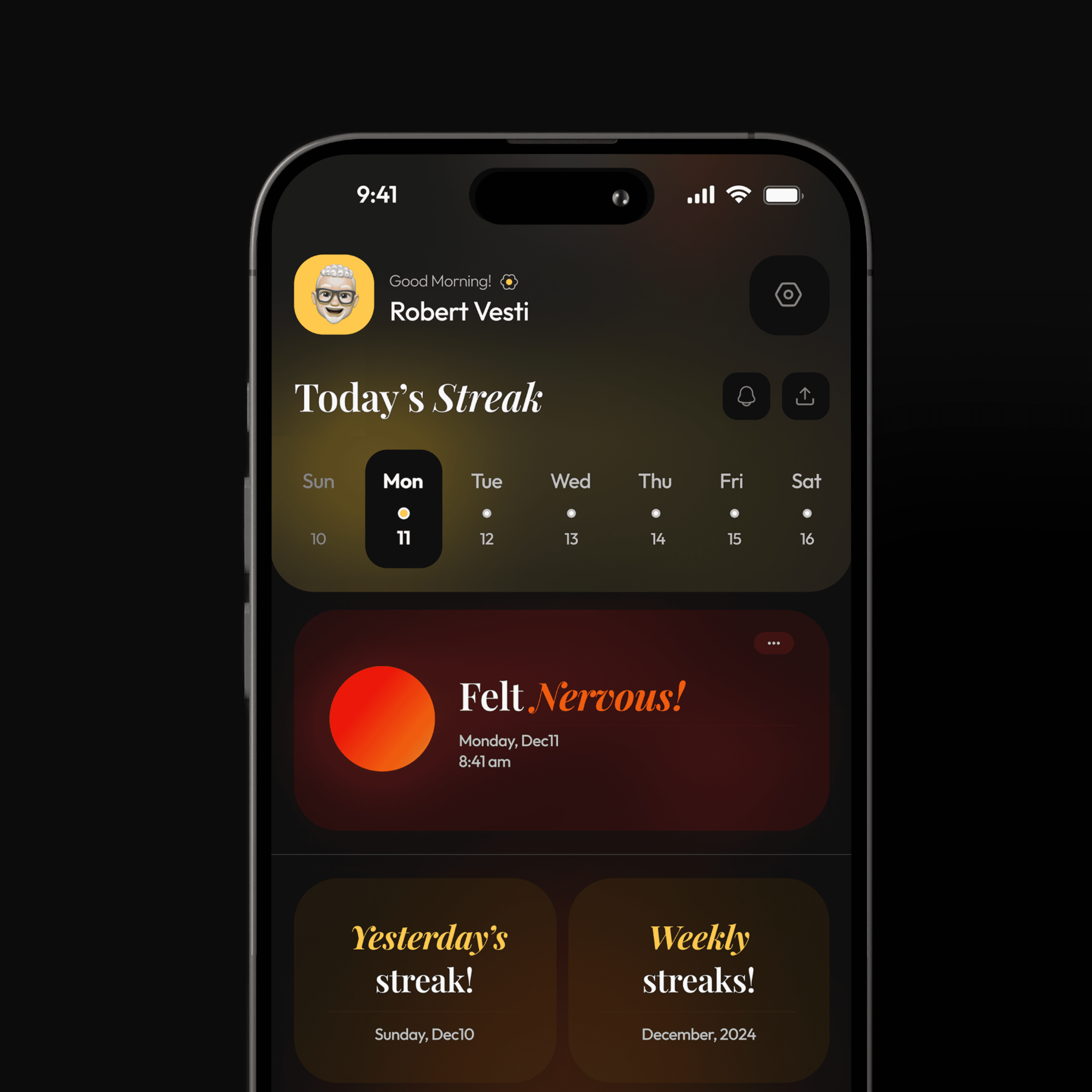
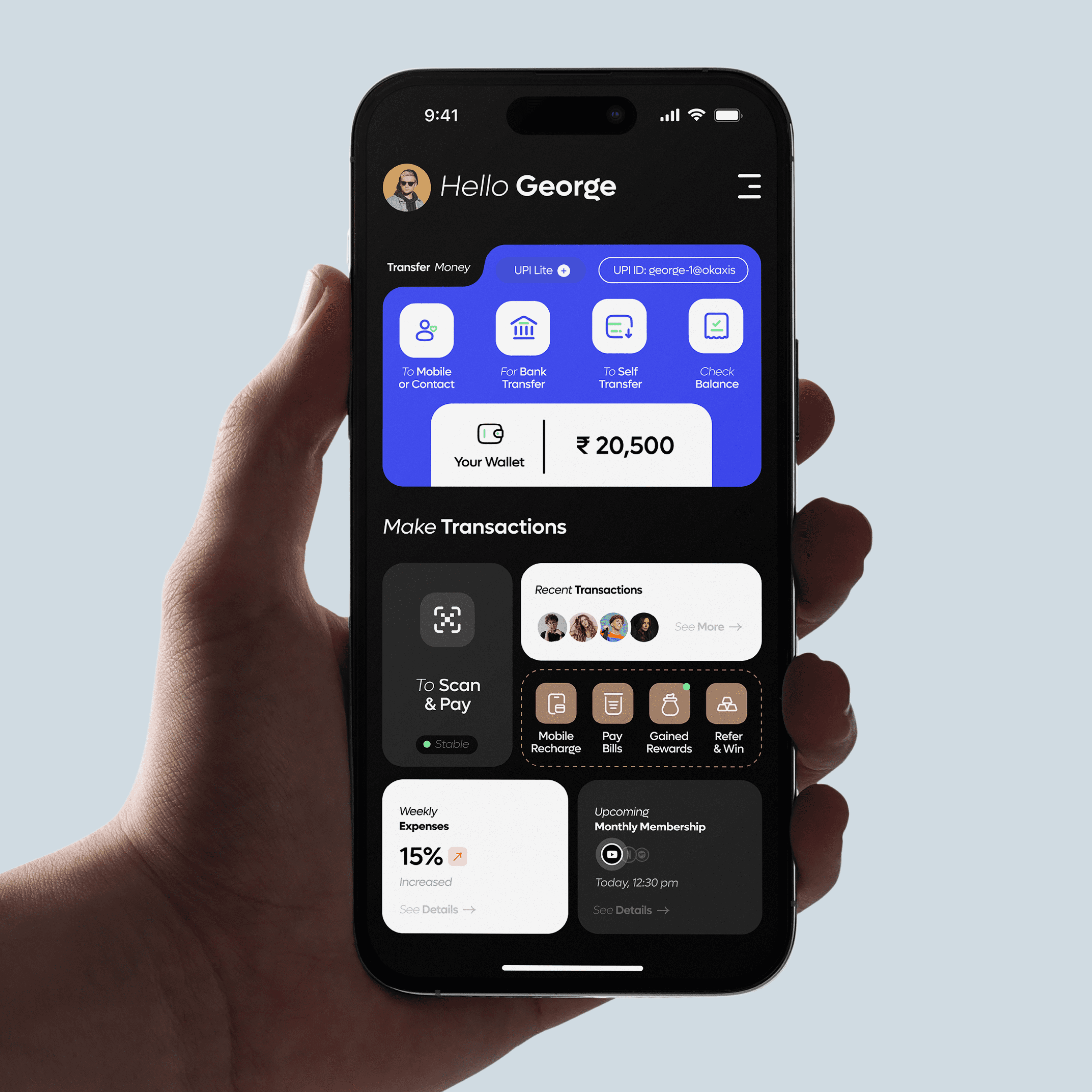
The Context
Fintech Nexus is a comprehensive digital wallet and payment ecosystem designed to simplify complex financial tasks. The objective was to create an all-in-one interface where users can manage multi-method transfers, track weekly expenditures, and handle bill payments within a single, cohesive dashboard. In a sector often defined by cluttered and intimidating interfaces, the goal was to provide a high-efficiency tool that feels both approachable and secure.
The Research and UX Understanding
My research focused on transactional anxiety and cognitive load in financial apps. Users often feel overwhelmed when navigating multiple payment layers. To solve this, I implemented a modular grid system that prioritizes the most frequent actions, such as Scan and Pay and UPI transfers, reducing the number of taps required to complete a transaction.
I categorized financial data into distinct visual containers to prevent information overlap. By introducing a Favorites bar with high-contrast user avatars, I transformed the repetitive task of searching for contacts into a personalized, one-tap experience. This understanding of user flow ensures that the path from opening the app to completing a payment is as direct as possible.

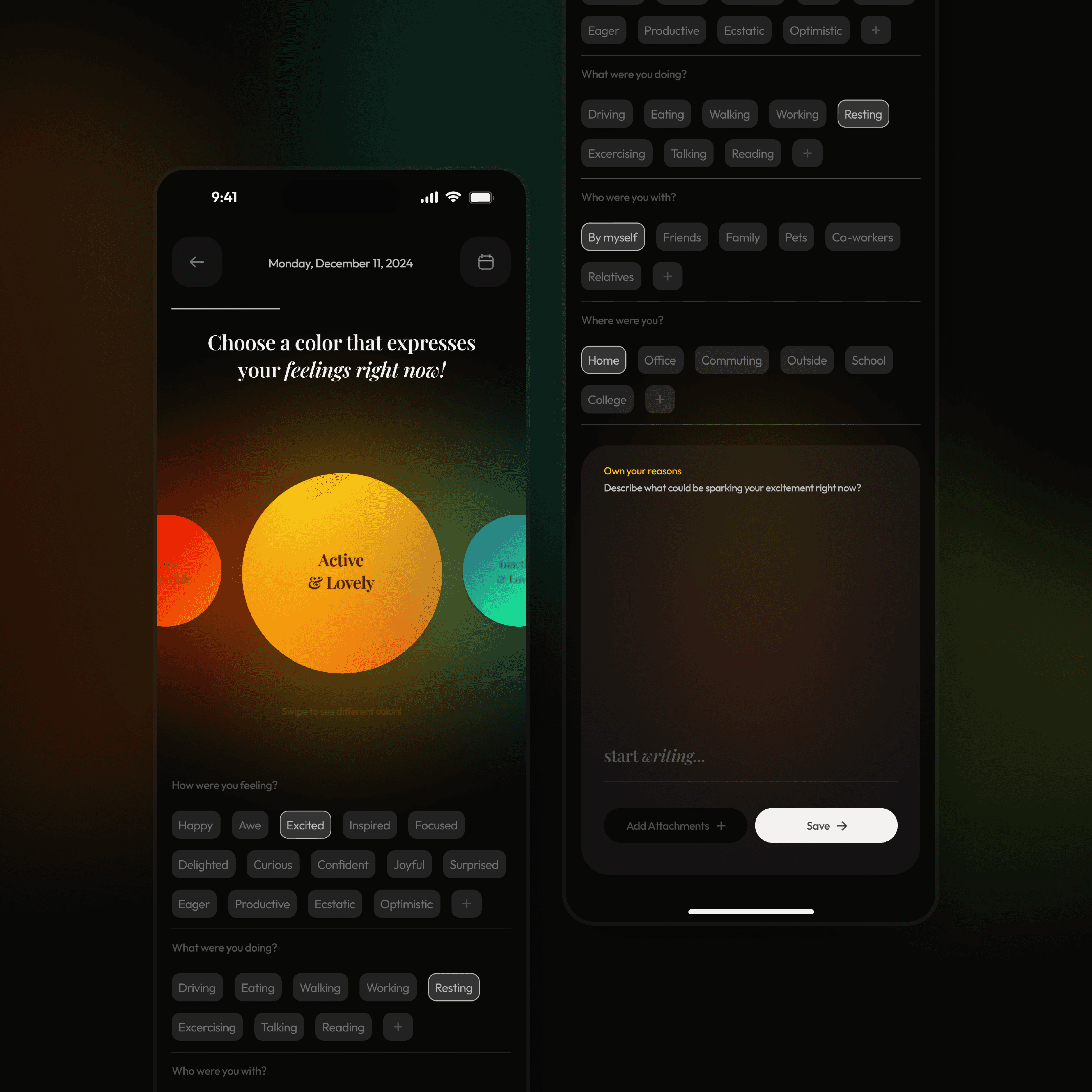
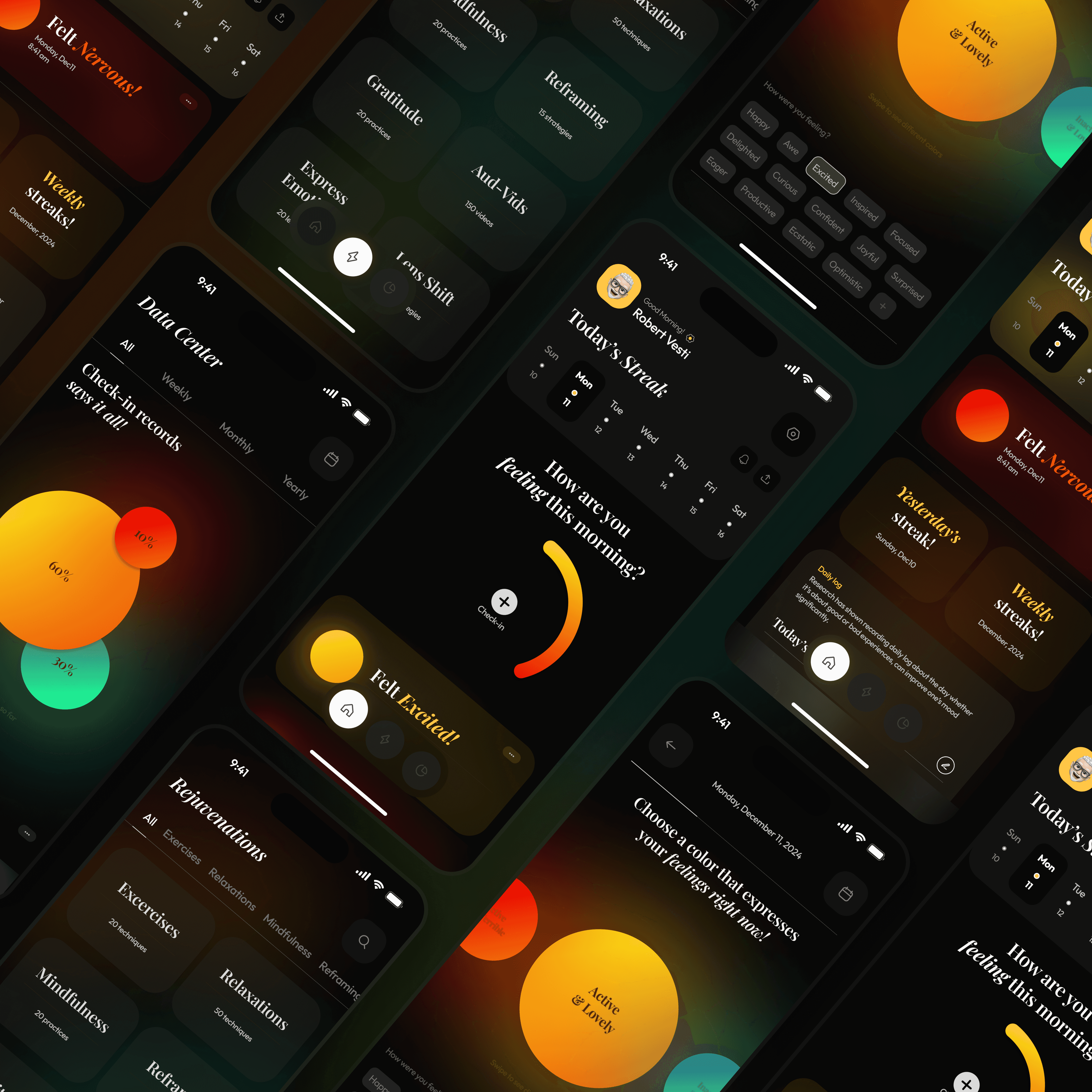
The UI Execution
The visual language is rooted in Empathetic Clarity, utilizing a soft, trust-driven color palette and high-legibility typography to ensure accessibility across all age groups.
Aesthetic Identity: I utilized a card-based system with "Friendly Geometry"—rounded corners and organic shapes that feel approachable rather than institutional. The interface uses a clean, white-space-driven layout to ensure that high-density medical data remains readable and non-intimidating.
Typography and Iconography: I used a bold, accessible sans-serif for time-sensitive data (like dosage timings) to ensure zero ambiguity. The iconography is custom-designed for quick recognition, allowing users to differentiate between pill types and health categories at a glance.
The Vital Dashboard: I designed the health tracking module using simplified trend lines. By translating raw biometric data into visual "Healthy Zones," I allowed users to understand their progress without needing a medical background.
Business Logic and CX Execution
To ensure the product scales as a professional health tool, I focused on data portability and high-value integration.
Customer Experience (CX) Design: I introduced a "Report Onboarding" feature that allows users to instantly share verified data logs with their doctors. This shifts the app’s value from a passive logbook to an active diagnostic tool, significantly increasing its utility in a professional medical context.
Technical Alignment: I built the system with a modular component library that supports a wide range of vital inputs—from blood glucose to heart rate. The UI is architected to remain stable even when large PDF reports are uploaded, ensuring a seamless experience for developers managing heavy data transfers.
Product Positioning: The approach targets the "Sandwich Generation"—adults managing both their own health and the health of aging parents. By positioning Veda as a premium, all-in-one health concierge, the design justifies a higher tier of user trust and market authority.
The Outcome
The result is a highly functional, compassionate digital journey that bridges the gap between patient needs and professional medical requirements. By balancing rigorous technical logic with an empathetic visual identity, I created a product that makes the heavy task of health management feel light and manageable. Veda stands as a definitive example of my ability to design complex, multi-user platforms that solve real-world human challenges.
Mood Palette
Scope
UX study · Product Design
Client
Concept
Year
[2025]
Industry
Mental Health
Mood Palette: Translating Emotional Nuance into Digital Clarity
The Context
Fintech Nexus is a comprehensive digital wallet and payment ecosystem designed to simplify complex financial tasks. The objective was to create an all-in-one interface where users can manage multi-method transfers, track weekly expenditures, and handle bill payments within a single, cohesive dashboard. In a sector often defined by cluttered and intimidating interfaces, the goal was to provide a high-efficiency tool that feels both approachable and secure.
The Research and UX Understanding
My research focused on transactional anxiety and cognitive load in financial apps. Users often feel overwhelmed when navigating multiple payment layers. To solve this, I implemented a modular grid system that prioritizes the most frequent actions, such as Scan and Pay and UPI transfers, reducing the number of taps required to complete a transaction.
I categorized financial data into distinct visual containers to prevent information overlap. By introducing a Favorites bar with high-contrast user avatars, I transformed the repetitive task of searching for contacts into a personalized, one-tap experience. This understanding of user flow ensures that the path from opening the app to completing a payment is as direct as possible.
The UI Execution
The visual language is rooted in Empathetic Clarity, utilizing a soft, trust-driven color palette and high-legibility typography to ensure accessibility across all age groups.
Aesthetic Identity: I utilized a card-based system with "Friendly Geometry"—rounded corners and organic shapes that feel approachable rather than institutional. The interface uses a clean, white-space-driven layout to ensure that high-density medical data remains readable and non-intimidating.
Typography and Iconography: I used a bold, accessible sans-serif for time-sensitive data (like dosage timings) to ensure zero ambiguity. The iconography is custom-designed for quick recognition, allowing users to differentiate between pill types and health categories at a glance.
The Vital Dashboard: I designed the health tracking module using simplified trend lines. By translating raw biometric data into visual "Healthy Zones," I allowed users to understand their progress without needing a medical background.
Business Logic and CX Execution
To ensure the product scales as a professional health tool, I focused on data portability and high-value integration.
Customer Experience (CX) Design: I introduced a "Report Onboarding" feature that allows users to instantly share verified data logs with their doctors. This shifts the app’s value from a passive logbook to an active diagnostic tool, significantly increasing its utility in a professional medical context.
Technical Alignment: I built the system with a modular component library that supports a wide range of vital inputs—from blood glucose to heart rate. The UI is architected to remain stable even when large PDF reports are uploaded, ensuring a seamless experience for developers managing heavy data transfers.
Product Positioning: The approach targets the "Sandwich Generation"—adults managing both their own health and the health of aging parents. By positioning Veda as a premium, all-in-one health concierge, the design justifies a higher tier of user trust and market authority.
The Outcome
The result is a highly functional, compassionate digital journey that bridges the gap between patient needs and professional medical requirements. By balancing rigorous technical logic with an empathetic visual identity, I created a product that makes the heavy task of health management feel light and manageable. Veda stands as a definitive example of my ability to design complex, multi-user platforms that solve real-world human challenges.